Nel Verhoeven | Invoerversie voor vertaling
How do you make a graph using Chart Builder in SPSS?
- Go to Graphs > Chart Builder.
- The dialogue window will appear (as in Figure 1).
- Choose the chart you would like to make by dragging a figure from the ‘Choose from’ window into the empty box (as indicated in the blue text). For this example, we chose a bar chart with two variables: gender and paid work. You also drag these variables into the box. Figure 2 shows you the choice you made in the dialogue window.
- Figures 3a and 3b show you how you can change ‘count’ into ‘percentage’. This will give you the relative percentages. This dialogue window (element properties) will appear automatically when you choose a graph.
- Figure 4 gives you the result: a clustered bar chart.
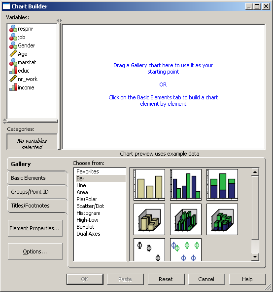
Figure 1 Dialogue window ‘Chart Builder’
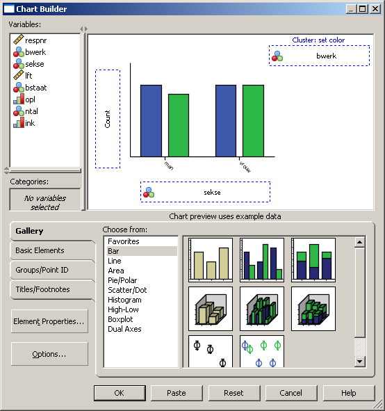
Figuur 2 Dialogue window showing choice for bar charts
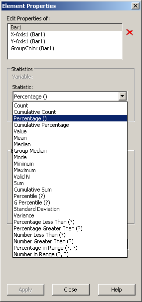
Figuur 3a In ‘element properties’ you change ‘count’ into ‘percentage’
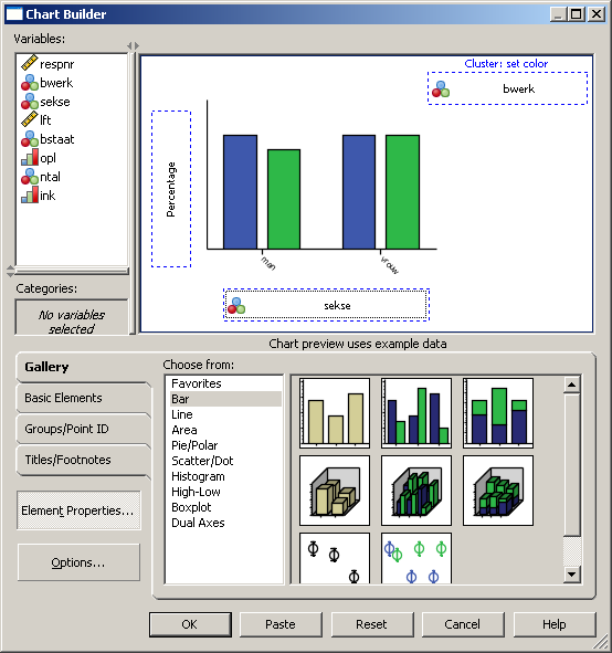
Figure 3b The choice ‘percentage’ appears in the ‘chart builder’
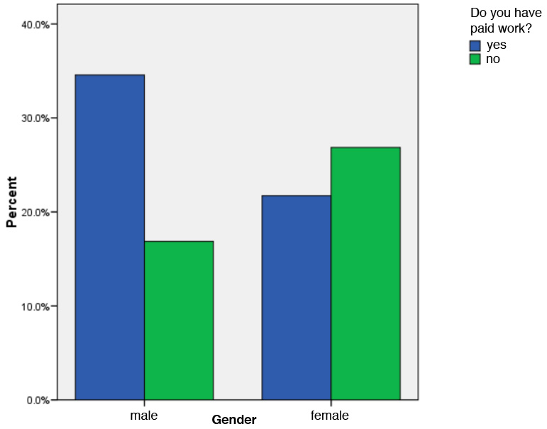
Figure 4 Clustered bar chart of ‘gender’ and ‘paid work’
